
Solving Problems with Design
My WhatsApp's About message
I hardly change my Whatsapp About message, when I do, it stays for months or even years, the only time it ever changes it is mostly me trying to sound witty and then I see how corny it is 5 seconds (or days) later and take it back to what was there before.
In the last 3 years, the two main WhatsApp’s About messages(that I can remember) have been;
I am the 1 he left the 99 to come find.
and
Solving Problems With Design
Oh, I remember why I always change it back, Mum seems to read them when she picks up the phone to text or call via WhatsApp. To be fair, she really got interested in it when I had the ‘99 he left to find the 1’ About message. She’d tell me to “Please change it back to that declaration of salvation”. For the most part it is wise to change it back and save myself a 2hr sermon than to explain my new witty status. So yeah, 5 days.
Lol, that is not what this article is about as usual, (I should find better ways to get to the point).
I saw a tweet about the Coca-Cola bottle, and I figured it will make a great collectors item. It seems people actually do collect it. Sweet!
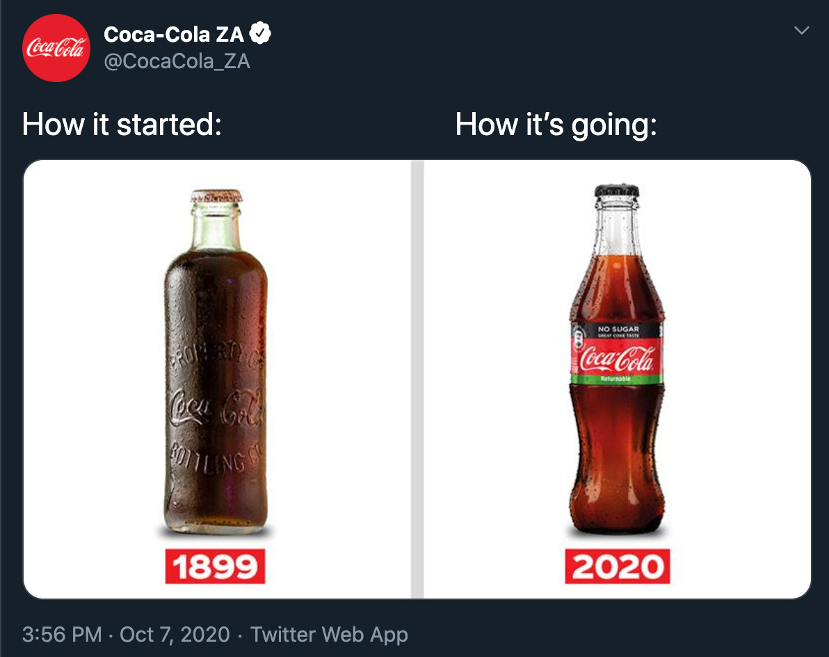
Coke has had a lot of bottles over the years, I find most of them to be pretty cool.

The the bottle of the late 1800s were sorta okay, well then again the bottle design was common with other soda bottles, they were called Hutchinson Bottles.
By the early 1900s the, 2nd bottle was seen as pretty bland by bottlers and I am sure the marketers were really pissed off, and there was the problem of it blending in with copycat brands (willing to bet that’s what pissed the marketing department off). This was definitely not good for business.
Something had to be done, well turns out good old design was a major contributor in solving the problem. Bottlers where approached to come up with designs to solve this problem. The task was pretty straightforward Coca-Cola said,
“Yo! We want a design that stands out when you see it, something that won’t make us have to tell you to make the Logo bigger"
Lol, okay what they really said was,
“bottle so distinct that you would recognise if by feel in the dark or lying broken on the ground.” 🤷🏾♂️
Well the design they loved the most was this. Created by Root Glass Company in Terre Haute, Indiana.
Industrial design FTW. ✊🏾 (I see why Caleb is obsessed with it)

Seems like a pretty great design to me, it stands out from the other bottles of its time, and looks interesting to hold. Heck looks easy to hold compared to what came before it.
“It’s a masterpiece of American vernacular design. Whimsical, intuitive. The shape has an erotic suggestion about it. Functionally it works — you can hold it in your hand very easily.” —Stephen Bayley, British Design Critic

The industrial designers did two things with this design, they made the clients happy and met their needs and they also made the customers happy and gave them a bottle that’s a delight to hold and drink from.
So, when I changed my WhatsApp’s About (sigh, why don’t I just call it bio?), Mum Noticed and simply said. “You have made it about design”, I said,
“Yeah, that is what I do mum, I use design to create a bridge of solutions between the clients and their customers, that way everyone goes home happy with their problem solved, and I get my reward in heaven and on earth.”

My philosophy of design is that it is life (everything is designed), but the above quote is how I see it when it comes to bringing value to the people (clients and organisations) I work with. A product that is ethical and contributes towards solving the problem for most of the parties involved (Lol, you can’t please everybody my guy).
Off to do some more designs. 😇
Stay safe guys.